Others
How to Make Your Images, Videos and AdSense Ads Responsive
19th January 2013Okay – let’s say it’s official: 2013 is the year of responsive design. Many tech journalists and gurus are predicting the same thing.
I totally agree with them. As mobile technologies (including mobile devices and gadgets) are reaching out to more people, your business website must evolve, in such a way that yours can be accessed from any devices with different screen sizes. Why?
Well, there will be more people browsing the web from their smartphones and tablets. The percentage of your website visitors coming from mobile devices will rise steadily – I’ve checked my analytics and this is a prominent trend, indeed.
It’s only natural for you to try to reach out to more audience; that’s why making your business website’s design responsive is strongly recommended.
What is responsive design, anyway? In layman’s term, a responsive design refers to your website front-end layout design that will automatically matched with the screen size of the device you use to access it, in such a way that your website doesn’t appear weird when viewed from a particular device.
Problems arise from your responsive design
When you have decided that you will adopt responsive design, you need to consider several things related to user experience and your monetization methods.
Website owners – I’m sure you have added images and videos to accompany your content. I’m also sure that many of you monetize your website with AdSense, ad banners and so on. While your website layout design is responsive, that doesn’t mean that everything you add into your website will be responsive, as well.
Some design templates come with responsive-ready CSS codes for image, video and any other stuff. But some others just don’t, leaving you with oversized images, videos, etc.
This is a real issue and if you didn’t address it properly, you will lose visitors and readers. So, here are the ways to make your images, videos and AdSense ads (or any ad scripts you use) responsive.
How to make post/article images responsive
If you are using WordPress, your images uploaded to the Media section will be responsive. But there are some cases that your images are not responsive.
If you have a large image, say, 620-pixel wide, it will look weird on a screen with 320px resolution. So, here’s the solution for your large image – in CSS:
img {
max-width:100%;
height:auto;
}
How to make YouTube video embed code responsive
Videos are not responsive, but you CAN definitely turn them into one! Here are the codes to make yours elastic, courtesy of Web Designer Wall.
For HTML5 video, just do like the responsive image above:
video {
	max-width: 100%;
	height: auto;
}
For video using IFRAME or OBJECT, here’s the CSS code:
.video-container {
	position: relative;
	padding-bottom: 56.25%;
	padding-top: 30px;
	height: 0;
	overflow: hidden;
}

.video-container iframe,
.video-container object,
.video-container embed {
	position: absolute;
	top: 0;
	left: 0;
	width: 100%;
	height: 100%;
}
and use this in your HTML:
<div class="video-container">
	<!-- your video here -->
</div>
How to make your Google AdSense code responsive
Making AdSense code responsive is challenging. You will violate the TOS if you change the AdSense ad sizes manually. So, to play by the rulebook, you will need to tinker the non-AdSense-specific Javascript code.
Using this command “window.innerWidth” you can control which code to display for a certain browser width.
So, instead of changing the Ad sizes, you display different AdSense ads for certain browser width. Think about this like A/B testing you normally do when you want to check the effectiveness of a particular ad size against the others.
Here are the code for responsive AdSense ads, courtesy of Labnol.org
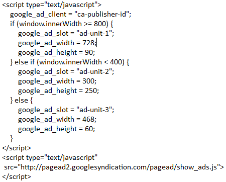
Be sure to change the “ca-publisher-id” with your publisher ID, and “ad-unit-1” “ad-unit-2” and “ad-unit-1” with your own ad codes. According to Labnol.org, this is not against Google AdSense TOS, but to be sure, check out with AdSense team to know what they think about this (I have contacted AdSense, but I haven’t get any reply.)
Update (Jan 19th): I have received a reply from the AdSense team, confirming that the above is acceptable – yay! Here’s the reply:
Hi Ivan,
Thank you for checking with us regarding the compliance of your modified AdSense coding.
We are pleased to let you know that it is acceptable and you are welcome to use it to monetize your website(s).Hope this clarifies.
Regards,
The Google AdSense Team
Takeaway
It may take a bit more effort to make your design layout and media embed responsive, but it’s a worthwhile one.
Always think about your user experience – those little things might mean so much for your users and your web business, even more than you think.
Good luck in your endeavour!
Photo credit: jiraisurfer via photopin cc

Ivan Widjaya is the owner of AsepOnde.com, as well as the founder of several online businesses: PrevisoMedia.com, Noobpreneur.com and Uptourist.com. He runs his business from anywhere, anytime he wants.
Comments
Garratt
I’m using a responsive template “Office” from themeforest, but it seems my header will not resize in IE, Firefox and Opera but it will resize in Safari and Chrome. Adding the above code and including !important had no effect unfortunately.
This header was even uploaded via WordPress Media Uploader and inserted into the theme using the link image URL.
Perhaps I need to hack the theme and just put it in the header within a div with unique classname? will this have any effect, or is it simply a bug with FF, IE and Opera?
I’ve also had this problem with WooThemes about a year ago before I stopped using them.
Ivan Widjaya
Garratt,
I have also experienced the same problem with some of the premium themes I use for my other blogs. It seems that the issue is in the CSS, and we know that cross-browser compatibility is an issue with some WP themes.
I’m not very good with CSS, so what I would suggest you to do is to contact the theme designer and ask them for a solution.
Cheers!