Online Business
You MUST Optimize your Website for Mobile Devices: 3 Case Studies
3rd March 2015I love stats. This is true for any areas of interest of mine. In basketball, I track NBA players’ stats to see how well they are performing in term of their numbers, as well as in what areas are the players improving or declining. In online business, I track my websites’ stats for the same reason.
I’m not really a stat junkie, but I am fascinated by how numbers can command trends (thus I believe that big data is the way to go for businesses to learn about their customers.)
In my line of business, which is online business, people can learn about the trends based on figures shown in analytics – the reliable ones, of course. Traffic counts, pageviews, and bounce rates are some of the stats that I check on a regular basis. However, there is one set of data that both you and I should pay attention to: Mobile traffic.
Just wondering, are you a website owner? Have you checked your Google Analytics (or any kind of analytics) for your mobile traffic details? I’ve seen some visible trends in almost all of my sites, so I think that the trend is (or must be) true: More site visitors are accessing your website from their smartphones and any other kind of mobile devices.
Digging deeper: My mobile traffic stats
Here are several proofs to interest you… these are real Google Analytics data from two of my sites, compared between 1-31 January 2014 and 1-31 January 2015 – plus the data from one site that is just 5 months old.
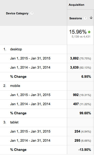
Website A: Mobile traffic increases 36 percent
Website A is a website with blog-style layout. The design is responsive, displayed nicely on all type of devices.
In Website A, you can see that, although traffic from tablet is in decline, traffic from mobile is improving from 11.22 percent to 19.31 percent. So, the total mobile traffic jump for this site is 17.88 percent to 24.25 percent.
Not that significant, but consider this: The site structure, as well as the marketing methods, hasn’t changed during that period of time.
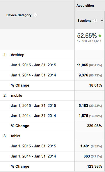
Website B: Mobile traffic increases 95 percent
Perhaps Website B might show a bigger picture: It’s a website with magazine-style layout. The design is responsive, but I use an app to display the content for mobile visitors.
Again, the site structure and strategy haven’t changed in the past 12 months.
Have a look at the stats: Tablet traffic goes up from 5.71 percent to 8.35 percent, and mobile traffic jumps from 13.56 percent to 29.23 percent. The total change? From 19.27 percent to 37.58 percent – the change is nearly twice.
In other words, more than a third of Website B’s traffic is coming from mobile device, and the change is nearly 100 percent.
Website C: Mobile traffic is 56 percent of total traffic
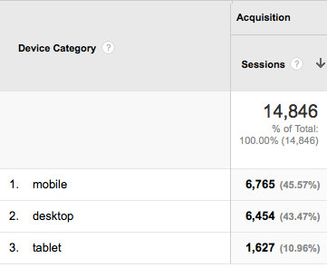
Here’s what might also interest you: In another site of mine, the mobile traffic is more than the desktop traffic. It’s using a responsive design, not a mobile app, in serving traffic to mobile devices.
I can’t show you the comparison as it’s not 5 months old just yet, but as a snapshot, as of today, the mobile traffic accounts for 56.53 percent of total traffic. This is a significant figure, considering the nature of the website (desktop-first layout design.)
In term of marketing strategy, I focus on social media marketing for this site more than the other two previous sites.
So, what do those figures mean?
Those three samples unanimously show a prominent trend: More people are accessing websites via their mobile devices – which lead us to these conclusions:
1. Go responsive – or use a mobile app, instead
You must use a responsive design or an app to serve your content – if you don’t want to lose valuable website traffic that can very much converted into leads.
And here’s to amplify the importance of this conclusion: Google has make it official that mobile-friendliness is one of the ranking signals, which mean that if your site is mobile-friendly, your rank can be positively impacted – and vice versa.
“Starting April 21, we will be expanding our use of mobile-friendliness as a ranking signal” – Google Webmaster Central Blog
2. You need to find a way to deliver your content with better readability
The debate between long form vs. short form content will continue, but one thing for sure: You need to make your content looks nice on mobile devices.
In term of mobile visits, I tend to believe that short form content that is easily consumable trumps long form content. But there’s always a way to present your content beautifully and effectively.
So, if your content is long form, make sure your layout can keep your mobile content consumers keep their attention on your content. If you can’t achieve this via your responsive design, be sure to use apps to present your content better.
3. More social media action!
Social media and mobile tech are a match made in heaven: Mobile devices help users to consume social media content easier, and social media content, which is typically short-form – and engaging – is best-suited for mobile devices.
With that said, you need to reach new audiences in social media – and engage them from their favorite hangout place. If you want to attract people from LinkedIn, you need to engage them in LinkedIn groups. If you want to attract people from Twitter, you need to converse with them using replies and Twitter videos – not DM’s!
And so on – you get the point 🙂 But don’t forget, if you want to direct them to your website, you need some call to actions, obviously: Don’t forget to paste your pages and/or blog posts’ URLs whenever you feel it’s appropriate – no spamming!
Takeaway

I’m not an expert in analytics, SEO and such, but even my untrained eyes can spot the trend. This means that the trend is prominent, and it’s has shifted toward everything-mobile.
Your next step would be this: If your website design is currently not responsive, find a way to redesign it – or change the design entirely to responsive design.
If you have a strong reason not to do so, be sure you use apps that can help you serve your website content optimally for mobile devices.
So, how about you? Do you spot the same trends as I do? Please share your findings!

Ivan Widjaya is the owner of AsepOnde.com, as well as the founder of several online businesses: PrevisoMedia.com, Noobpreneur.com and Uptourist.com. He runs his business from anywhere, anytime he wants.